The correlation between spending and winning in the NBA: trends by year and by team
Money is the topic of the moment in the NBA, what with the unfortunate lockout and all. One relevant question is how much the budgets of different teams affect their abilities to win. The Lakers and Knicks, in the two biggest markets, can spend pretty much anything and still turn a profit. The Grizzlies and the Bobcats, not so much.
But how does spending correlate with winning for NBA teams?
There has been a fair amount of discussion (although it seems I am about 2 years late) on this issue. Naively, most people would probably say yes. More money means you can sign better free agents. Furthermore, having a good team already means good players will want to come play on that team, which is kind of like a positive feedback loop between money and talent. If you have money, you've signed some good players, so you have a good team, so more good players want to play for your team, etc etc etc.
However, there are plenty of factors that go into winning besides how much a team spends. Luck is a huge factor, with player development, injuries, and most importantly the draft. The draft itself is especially critical because the (now expired) NBA collective bargaining agreement (CBA) mandated that rookies recieve a fixed salary for their first several years in the league. That means that the league's 2011 MVP made only half as much money as his veteran teammates.
Based on this, the general principle of the relationship between payroll and wins is: Blindly spending more money doesn't necessarily mean the team will win more, but spending less money does restrict the team's options relative to teams with larger budgets. With this in mind, you can probably guess that there is some positive relationship between payroll and wins, but that it is fairly noisy. Since there is no comprehensive summary of this data anywhere that I could find, I decided to gather the data and run a few calculations on it.
First, a word on the data. There is no perfect, wonderful source of this kind of data. I scraped player salaries from Basketball-Reference.com (which is probably the most reliable source out there) using Beautiful Soup. Normally I'd post the script and data here, as I'm all about open source and open data, but I don't think Basketball-Reference.com appreciates people scraping their data, and I know they don't allow people to republish their data. So you'll just have to trust that I did it correctly.
Also, I did try normalizing the data by the annual salary cap, as the salary cap changes every year in the NBA. However, it didn't substantially change any of the correlations, so I'm showing the raw data here as it's more straightforward that way.
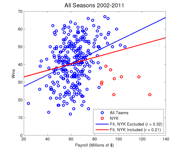
The first figure below shows a scatter plot of wins versus payroll for each of the 30 teams over the past 10 seasons, so there are a total of 300 data points. Results are shown both including and excluding the Knicks, as their fruitless overspending in the last decade could represent an outlier. The lines are linear regressions.

This figure shows that the Knicks were horribly managed in the 00s, which of course is no surprise. Besides that, it looks like there is a fairly noisy and weak correlation between wins and payroll. Probably about the kind of relationship you'd expect, given all the other sources of variability.
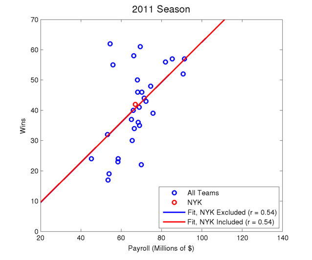
I made a bunch more plots as well, available from the dropdown menus below. For the first set of images, showing the results broken down by season, results are again shown with and without the Knicks.

If you flip through all of those seasons, even including the Knicks, there is a positive correlation between wins and payroll every season. Yes, sometimes the correlation is small, like in 2005, but it is certainly always positive. It's not entirely unexpected that this happens to some extent, because if there is a correlation in one year there is probably a correlation in the next year, as players don't move around that quickly. But a correlation every year for a decade? When most teams probably don't have any player on their roster in 2011 that was on their roster in 2002? That's a trend.
The Knicks are also interesting in this series of images. They start off well below the regression line (higher payroll, lower wins) and remain way out there for the first 9 years. But in 2011, suddenly they cut enough salary and won enough cames to move above the line. So this past season, they actually performed better than you would have expected, given their payroll.
Another apparent trend is that, in the past few seasons, the correlation between wins and payroll is much higher than it was previously. This does fit in with the meme that stars now want to play with other stars on superteams. Or maybe it could be explained by teams getting smarter. If you have a crappy team, why would you spend lots of money on it? In the long term, it makes more sense to bottom out and rebuild cheaply with the draft. Maybe teams are figuring this out more these days. But I wouldn't read too much into this increased correlation trend, as it's a pretty small sample size. If the pattern continues for a few more seasons, that will be interesting. Of course, the new CBA might so significantly change the financial structure of the league that such comparisons may not be easy.
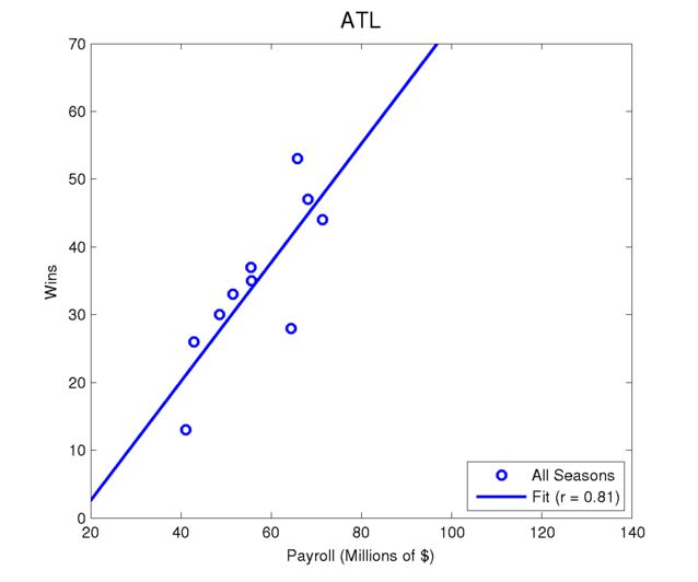
I also looked at how the correlation looks for individual teams. You really shouldn't read too much into this, as there are only 10 data points and nearby years are likely highly correlated (i.e. a team's salary and skill level doesn't usually change much from year to year). However, this does give you some indication as to which teams are getting results for spending extra money.

With Boston, you can see pretty clearly where they got the Big 3, which was when their payroll shot up. Atlanta and Cleveland improved as they added payroll, largely due to improvement in their homegrown talent as they added salary to become contenders. Although, this seems almost tautological. Wouldn't teams always only add payroll when they are on the verge of contending?
Turns out, no. Several teams have the opposite pattern. The Pistons won a title (and had several good playoff runs) with relatively low payrolls, but their decrease in performance in recent years was not matched by a reduction in payroll. Instead, they signed several expensive free agents who didn't work out. New York and Oklahoma City have the largest negative correlations between winning and spending. For the Knicks, this is because of their incredibly expensive yet abysmal teams of the mid 00s. For the Thunder, it's because their current excellent team is built around cheap rookie contracts for their stars.
There are also several teams who seem to have absolutely no relationship between how much they spend and how much they win. Sacramento's payroll has been surprisingly constant over the past decade, but they have been near the top and bottom of the league in wins. Maybe this is part of the reason they are struggling financially?
So, in conclusion, there is a clear and unquestionable positive correlation between spending and winning in the NBA. However, the correlation isn't that strong, and there are plenty of outliers every year (not just the Knicks). Furthermore, it seems like the correlation may be increasing in recent years, but there isn't really enough data to be sure.
Update: July 11, 2011
As a bonus, semi-unrelated conclusion... I submitted this article to reddit and got a fair number of visitors. By checking my server access logs, I can see which teams were viewed most from the second drop down menu, which I guess is a marginally interesting indicator of which teams people care about.
| Hits | Hits | Hits | ||||||
|---|---|---|---|---|---|---|---|---|
| 1. | ATL | 937 | 11. | HOU | 29 | 21. | MIL | 21 |
| 2. | BOS | 105 | 12. | OKC | 28 | 22. | ORL | 21 |
| 3. | LAL | 88 | 13. | TOR | 26 | 23. | DEN | 20 |
| 4. | CHI | 61 | 14. | UTA | 25 | 24. | NOH | 20 |
| 5. | DAL | 47 | 15. | GSW | 24 | 25. | MIN | 19 |
| 6. | NYK | 47 | 16. | SAC | 24 | 26. | NJN | 17 |
| 7. | MIA | 46 | 17. | SAS | 24 | 27. | POR | 17 |
| 8. | CLE | 35 | 18. | WAS | 23 | 28. | PHI | 16 |
| 9. | CHA | 33 | 19. | DET | 22 | 29. | PHO | 16 |
| 10. | LAC | 30 | 20. | MEM | 22 | 30. | IND | 15 |
Atlanta is a control, as it is the default image so it was loaded for everyone. After that is Boston: a popular team, good position in the alphabetical listing, and specifically mentioned in the text. I also mentioned Cleveland, Detroit, New York, and Oklahoma City as having interesting graphs, but only New York has a particularly high view count, along with all the other popular teams from big cities. So it seems that people cared less about my insightful commentary and more about what their favorite team's graph looks like.