Play-by-play redesign
The new football drive charts made me think more about how ugly the live sim experience is in all of my games. One problem is that the play-by-play is pretty bad. Basically just plan text. Can I do better? I think so!
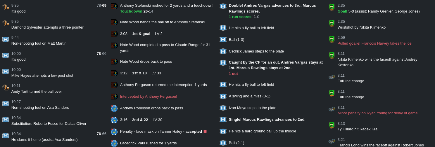
Here is my attempt at redesigning the play-by-play log for all of the sports:

All the sports look a little different, which I think is necessary to represent the action in each sport.
Scoring is very common in basketball, so each basket is not that big of a deal. In other sports, each score is hugely important. So the other sports get scores highlighted in green, but basketball doesn't.
In basketball and hockey, I show the clock with every event. But for football I only show it before the play, with down and distance. And baseball of course has no clock, but it does have outs, which get shown in bold red below a play with an out.
Other special plays are flags in football (they now use the same icons/colors as in the drive chart), turnovers in football (shown in red), penalties in hockey (red), and pulled goalies in hockey (also red, since the effect is kind of similar to a penalty - expect somebody to score soon!).
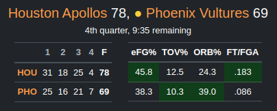
I also added a possession indicator to the main score display, so you can easily see who has the ball (or the puck, or who is at bat):
