Improved UI for the four factors in box scores
The four factors are stats created by Dean Oliver to give some insight into a box score. By quickly looking at 4 numbers per team, you get an idea about the story of the game and why one team won. The four factors are:
- Effective field goal percentage (how well did you shoot)
- Turnover percentage (how well did you take care of the ball)
- Offensive rebound percentage (how well did you rebound)
- Free throws per field goal attempt (how often did you get to the line and convert your FTs)
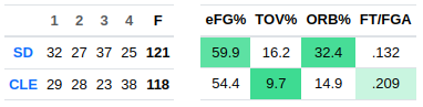
Those have long been shown in BBGM box scores, with the better value highlighted:
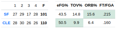
In that screenshot you can see that each teams won 2 categories, however Cleveland actually won the game by 9 points. If you look closely at the four factors you can see that some are closer than others. That's kind of an unintuitive UI - at first glance it looks like a 2-2 tie, but really Cleveland did better.
I thought of a solution to this when I saw this Dean Oliver tweet about how his new book (Basketball Beyond Paper, preorder now!) will include formulas to determine roughly how many points each of the four factors is worth. If I had those formulas, I could show how much the lead is in the four factors, rather than just which team is leading.
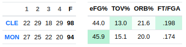
Even though the book is not out yet, Dean was kind enough to share the formulas here. I will omit the details, but it's nothing crazy. Like an extra turnover costs you an extra possession's worth of points. Stuff like that. The end result looks like this:
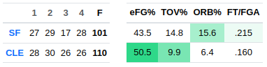
That's the same game as above, but now with variable highlighting it's obvious at a glance that Cleveland won because they shot a lot better than San Francisco, and San Francisco's edge in free throws was negligible by comparison.
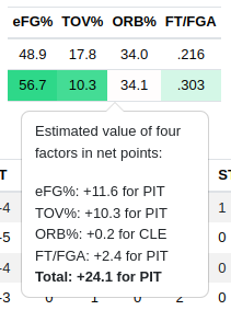
And now if you click on the four factors table, you get a popup showing the numeric values behind the colors:
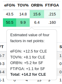
So by the four factors, Cleveland is estimated to have won by 14.2 points. In practice, they only won by 9. It's not going to be exact because there are various things that these formulas don't account for. But most of the time, they are even closer than this.
Here are some other examples of how this works.
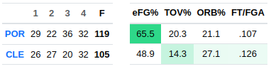
Portland only won one category, but the margin was huge compared to the ones it lost:
This was a close game, but there were huge differences in the four factors between both teams that roughly offset. That's why you see dark green.
This was another close game, but here the four factors are all pretty similar between teams, so the highlighting is much lighter:
And one other interesting thing I noticed is that if one of the factors is very close, it's possible for the points calculation to run in the opposite direction. But this is pretty rare and only happens when the values are close to 0. It's just a quirk of how the formulas are specified.
Overall, I think this is a nice little UI improvement that will especially help people who sim through games quickly.
Thanks again to Dean Oliver for sharing these formulas with me, and check out his new book!